
Kinney Lane FoodsFarm-to-table made beautifully simple.
Packaging Design
The Challenge
Kinney Lane is a prepared-meal brand focused on wholesome, made-from-scratch food using real ingredients. When I learned about their mission, I was immediately inspired by the blend of nutrition, warmth, and quality — but I saw an opportunity to elevate their packaging to better reflect those values.
Though this concept was developed as part of a pitch and not a finalized client project, I wanted to explore how thoughtful design could help Kinney Lane’s products feel as good as they are for you.
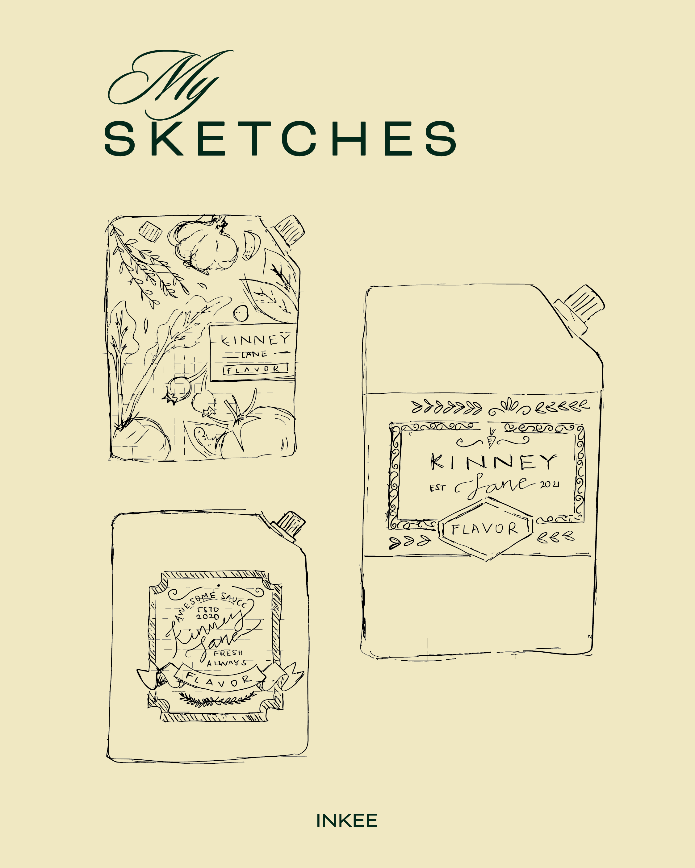
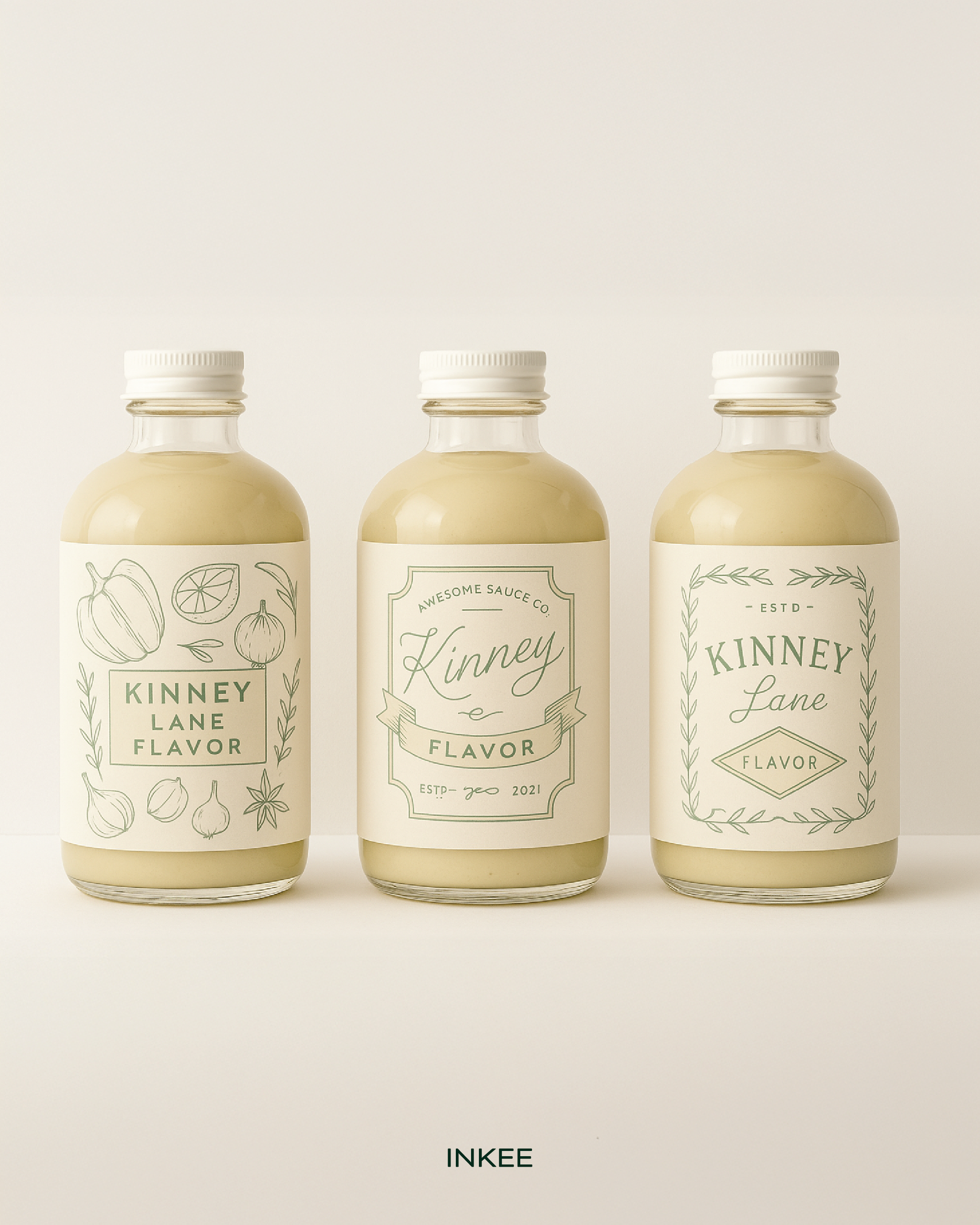
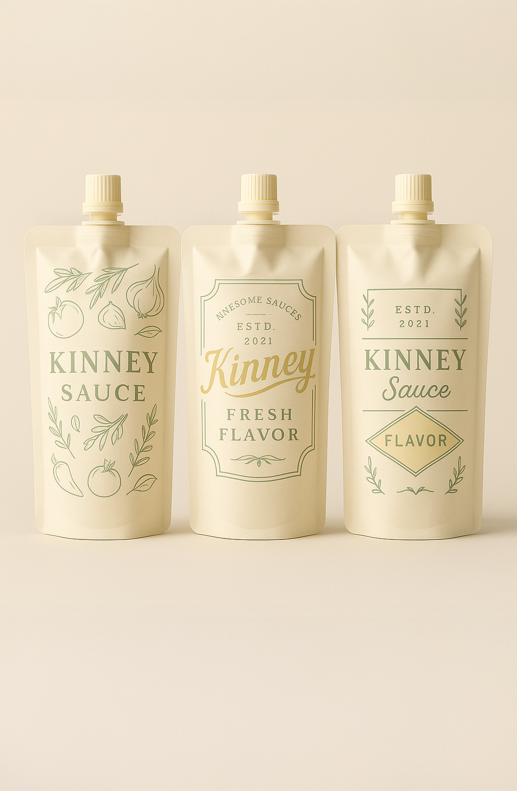
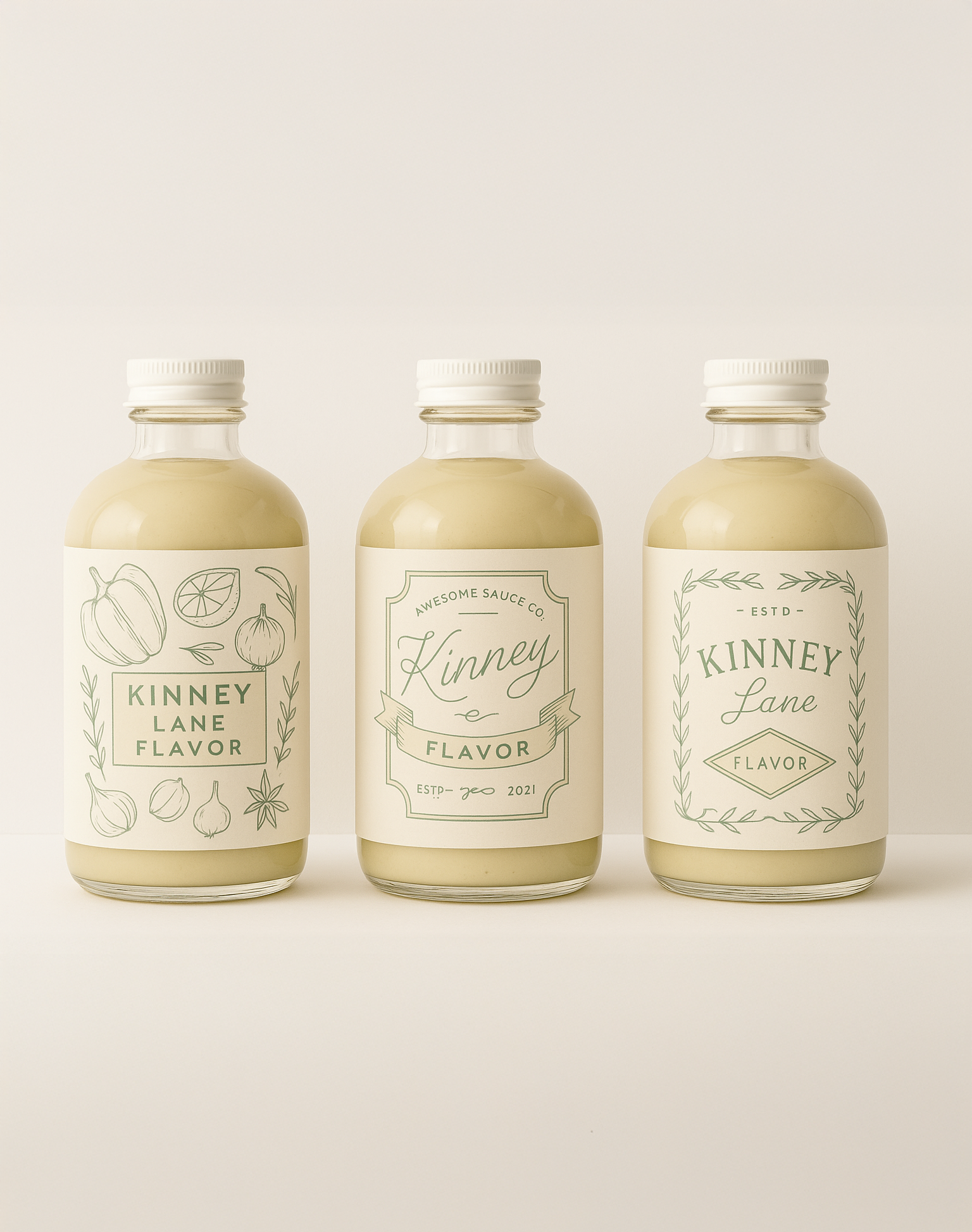
The VISION
The goal was to create a packaging system that felt clean, warm, and approachable — capturing the ease of nutritious eating with a touch of everyday luxury.
I used:
A soft, French country–inspired palette to signal freshness and calm
Delicate line illustrations (no fills) to celebrate whole ingredients without overwhelming the design
A balance of serif typography for the logo and soft sans-serifs to communicate trust, warmth, and clarity
Each pouch was color-coded with muted tones to help customers easily identify different meals, while keeping the brand identity cohesive across flavors.
The Impact
While this concept wasn’t selected, the final designs sparked positive feedback and interest — and I’m proud of how they captured the spirit of Kinney Lane. This project is a perfect example of how design can connect story, purpose, and shelf appeal — even when it's just an idea.